
This week I did some reading on Wikipedia, which I probably should have done sooner. I read about critical bandwidth, and also consonance and dissonance. The explanation I’m currently exploring is there, as well as several others including that one about long patterns I gave up on reading (although I am starting to think I didn’t give it enough credit) and the idea that the experience of dissonance is a response to rare or unusual sounds.
I took the formula for critical bandwidth and used it to build a new function for my visualizer. By the way, I have so far neglected to mention how I use Desmos. Many times in my life I have gone to Desmos with some mathematical question, and used it to tinker with functions and get a sense for them. In much the same way. Here is a reenactment of what it looked like to work on a new function:
That function in blue becomes the basis for the new model. What I ended up with was this:
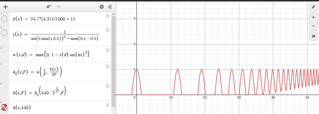
Previously, the frequency bands of the harmonics shrunk down, so they would only have indicated overlap in the cases where it was very close. This time, we are using real frequencies. The y axis represents 440 Hz (standard A4), and the widths of the bands are given by that formula b(x), for which Wikipedia cites Glasberg and Moore. I can already tell that what this produces is going to produce more visually interesting. For example:
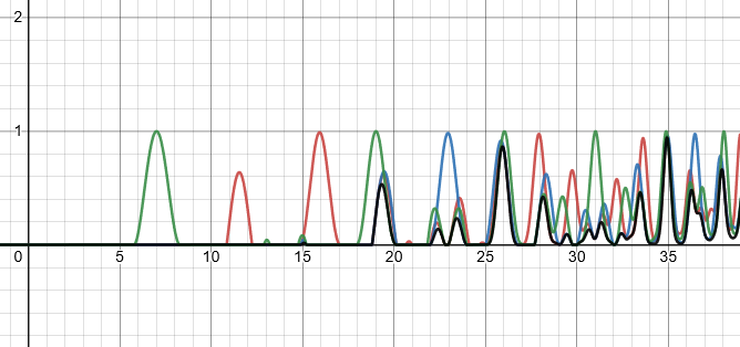
Hopefully it is also more useful and accurate in terms of how we hear. This week I hope to make some of those colour-gradient visualizations with this new model, and maybe figure out four-note chords. I imagine that I can continue to use just three colours, by ignoring the chord’s fifth, or using the same colour for it as for the root. Or maybe there is some method of combining four colours in a way that is still visually understandable.